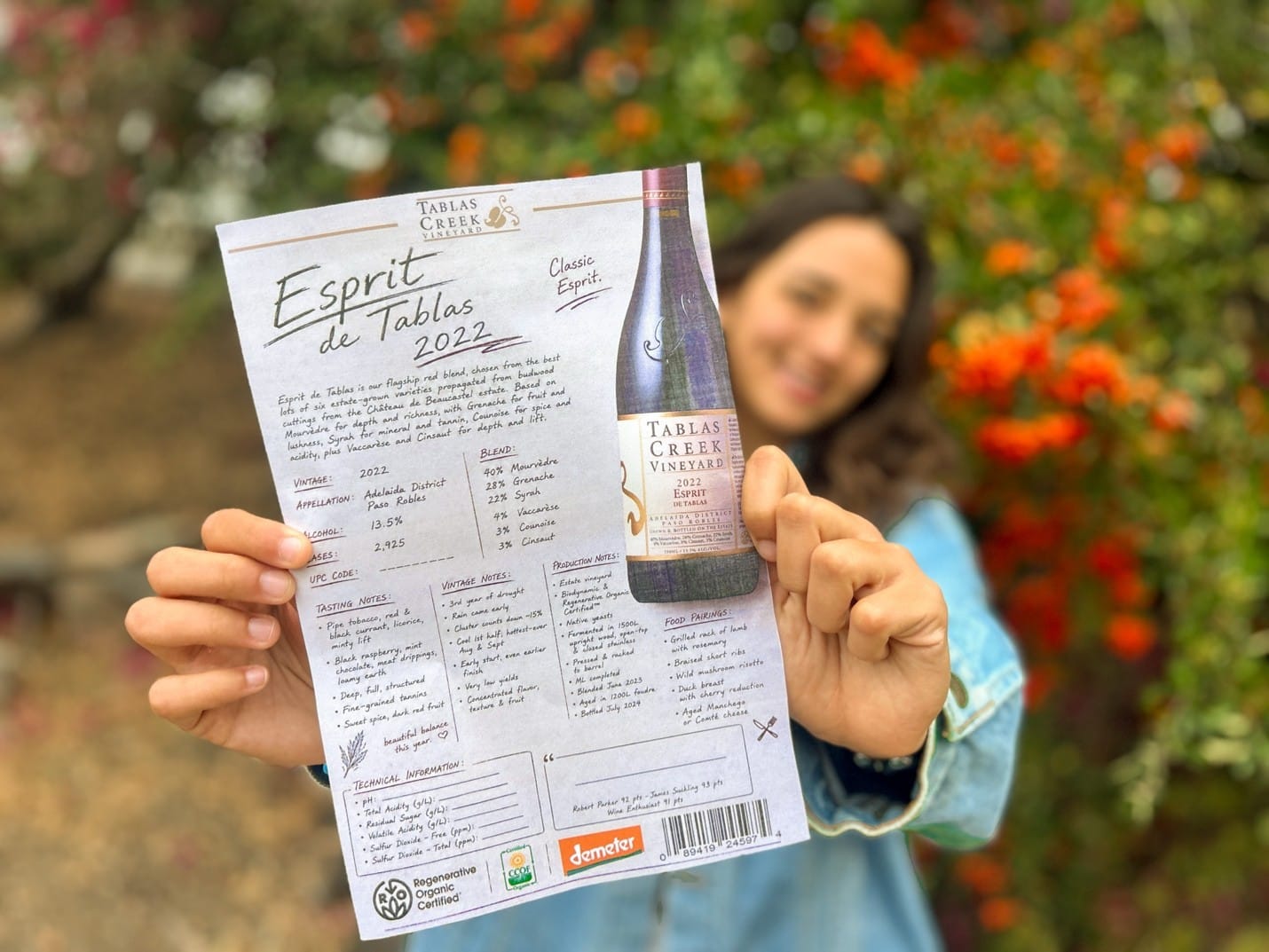
Re-Imagining the Tablas Creek Technical Sheets: Lessons from a Summer Marketing Internship
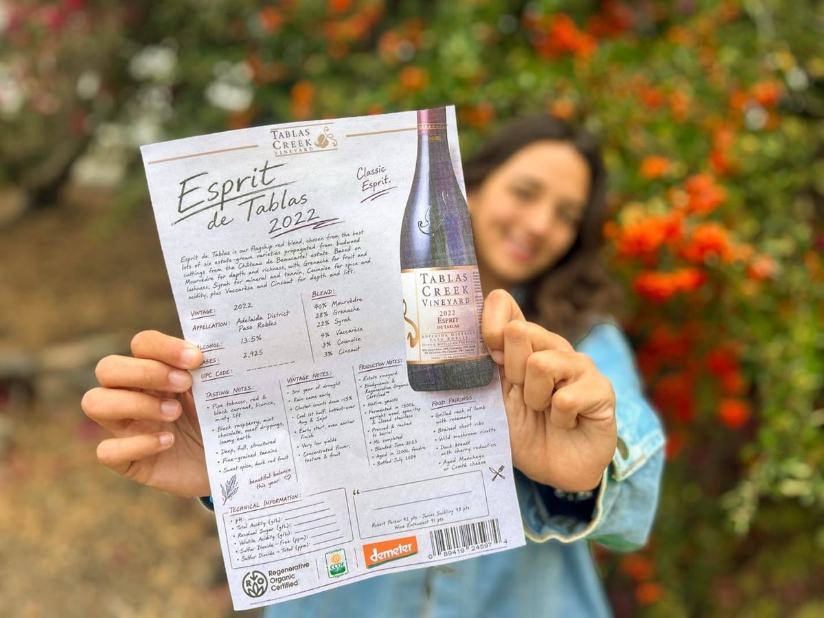
This summer, marketing intern Samantha Naylor reimagined our tech sheet format. After surveying wine professionals, she built a reusable InDesign template balancing aesthetic appeal with deep technical details, proving that great design always serves its audience.
By Samantha Naylor
This summer I had the pleasure of working as the Marketing Intern to the Director of Marketing at Tablas Creek. I worked on a lot of projects I was already comfortable with (social media posts, event and product photography, copywriting), but my big project for the summer was redesigning our wine technical sheet, or "tech sheet." It was something that pushed me out of my comfort zone, taught me a lot, and was an incredibly rewarding project.
In case you're unfamiliar, a technical data sheet is a one-page document created by a winery or producer that details the specific features, production methods, and flavor profile of a particular bottle of wine. Our broker, Vineyard Brands, had been responsible for creating our tech sheets for the past two and a half decades. But they dissolved that portion of their services at the start of the year, bringing the process in-house. That transition sparked the idea that maybe we could start looking at our tech sheets differently. In what feels like the digital decade, where everyone's social media feed reads like scrolling through Vogue or The New Yorker, it felt only appropriate that the Tablas Creek tech sheets get a makeover worthy of the incredible wines they were showcasing. Just like the wines themselves are a work of art, we wanted the technical sheets to be eye-catching and something to remember.
Where We Started
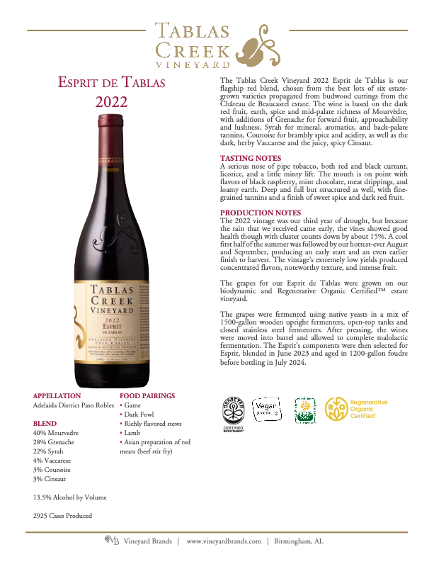
Before diving into the redesign, it's worth showing where we began. Here's what our tech sheets looked like under the old format:
Starting With Inspiration
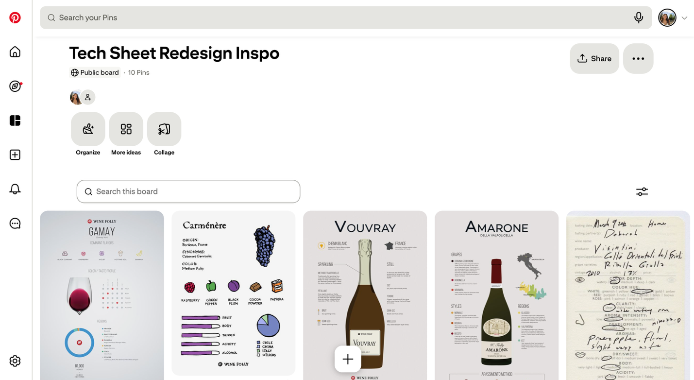
Being Gen Z, I'm no stranger to aesthetic needs, or "the human drive to experience beauty, balance, form, and harmony in life." That's why the first place I went when this project was assigned to me was somewhere I know well... Pinterest. To begin my ideation process, I created a Pinterest board of things I felt were visually appealing. The next step was to look up various technical sheets from other wineries: see what was standard, see what was unique, see what was overdone. Going between these two sources, I was able to get a pretty good idea of what the new tech sheet could be. I wanted the finished sheets to feel modern, fun, and intentional while still fitting the Tablas Creek brand. The next step was to bring these ideas to life.
From Pinterest Board to Mockups
After my ideation process, I created three different mockups for directions we could take with the redesign. I used the 2022 Esprit de Tablas as my "base model," recognizing that in order to successfully pitch a redesign, I would need to present a few different options and routes. A bit of background on myself: I'm currently a university student pursuing a degree in Wine and Viticulture with a Wine Business concentration from Cal Poly SLO. While I had experience using tools like Photoshop, doing graphic design and ideation at this level was a whole new learning experience for me. With guidance from my boss, Ian (the Marketing Director), a couple of YouTube videos, and a whole lot of creativity, I was able to create three mockups, each with a different "vibe."
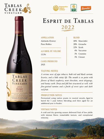
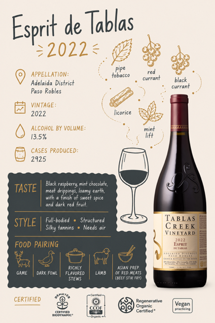
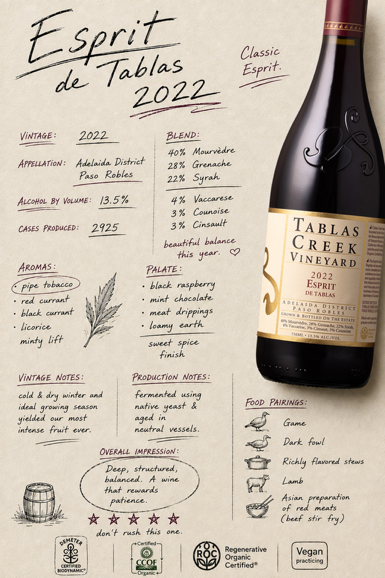
Mockups in order: Estate Elevate, Cartoon Core, and Cellar Script
Estate Elevate
For wine professionals who want their tech sheet to read more traditionally, I created Estate Elevate. This mockup sticks closer to a traditional, typical tech sheet layout, but dresses it up with more visual accouterments: pull quotes, small iconography for things like production notes and pairing suggestions, and a photo of the Tablas Creek estate lining the bottom of the page.
Cartoon Core
Who doesn't like a Sunday cartoon? This technical sheet was meant to be very playful and fun while staying informative, appealing to the eye while still getting a good amount of information across.
Cellar Script
I really liked the idea of a technical sheet that felt as though the winemaker had written it up by hand on an old piece of paper. I thought it would feel very authentically Tablas Creek.
Getting Feedback From the People Who Actually Use Them, and Choosing a Direction
After completing all of my mockups, it was time for feedback. Technical sheets are typically presented to wine professionals and industry buyers, so we wanted to know what they wanted in a tech sheet. We sent out a survey to several wine salespeople and professionals to get their input and help steer our creative direction. The feedback we received was very insightful, and it gave me the realization that in terms of information presentation, I needed to take a much more technical route. While I'm usually of the mindset that less is more, when it comes to technical sheets for a serious wine, those wine professionals want to know all the little details: production notes, vintage notes, food pairings, the whole shebang. Once survey responders got back to us, we concluded that the direction we would move forward with was our Cellar Script mockup.
The Bigger Challenge: Creating a Template
The final step of this project was creating a template. As I mentioned before, because technical sheets had been passed onto the marketing department, I needed to make something that was attractive enough to make an impression, but practical enough that someone on the marketing team could use it again and again.
I did this in Adobe InDesign. Turning a single, hand-picked mockup into a reusable template meant thinking less like a designer and more like a systems-builder. A one-off mockup only has to look good once; a template has to look good every single time, no matter which wine, vintage, or set of tasting notes gets dropped into it. I had to go through the Cellar Script design and identify every element that would need to change from bottle to bottle (the wine name, vintage, varietal blend, alcohol percentage, harvest dates, aging, production numbers, tasting notes, food pairing suggestions, accolades, and more) and build flexible text and image frames in InDesign that could hold a little more or a little less copy without breaking the layout. That meant setting up paragraph and character styles for each type of text, building master pages so the branding stayed consistent, and stress-testing the template with wines that had unusually long tasting notes or unusually short production stories, to make sure nothing would ever overflow or leave awkward empty space.
The Result and What I Learned
The technical-sheet redesign ended up teaching me more about marketing than I expected. My first instinct was to focus on the visual side of the project. I enjoy creative work, and I naturally gravitate toward color, typography, composition, and aesthetics. But as the project developed, I realized that the best design decisions came from combining that creativity with a clear understanding of the audience. A beautiful technical sheet isn't necessarily a good technical sheet. A good technical sheet is one that catches someone's attention, communicates information clearly, feels like it belongs to the brand, and makes the person using it want to keep reading. This project was especially valuable because it reminded me that design is rarely about designing for yourself; it's about designing something for a greater purpose.